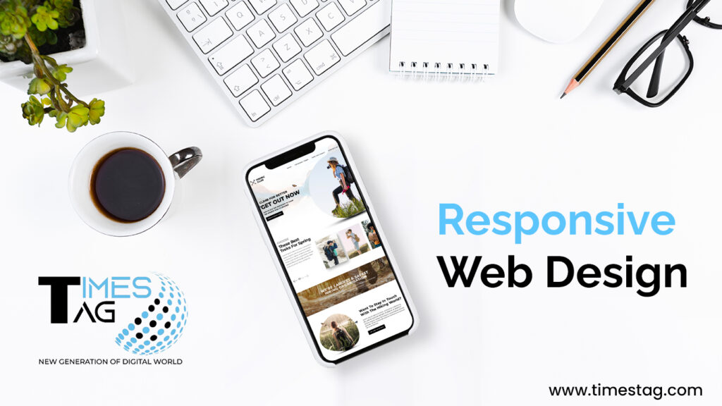
What’s up to all online enthusiasts? Today, we’ll look at the art and science of responsive web design (RWD), essential for ensuring that your websites appear great on devices of all shapes and sizes. Let’s go over the basics and advanced skills of RWD together.
What is Responsive Web Design:
Responsive web design creates websites that adapt dynamically to the user’s device, resulting in an ideal viewing and interaction experience. In simpler terms, it’s about crafting sites that look great and function seamlessly, whether on a desktop, tablet, or smartphone.
Why is Responsive Web Design Important?
- Device Diversity:
With the myriad of devices available today, ranging from large desktop monitors to pocket-sized smartphones, catering to diverse user experiences is crucial.
- SEO Benefits:
Google and other search engines promote mobile-friendly websites in search results, making RWD an important aspect of search engine optimization (SEO).
- User experience:
A responsive design improves user experience by making the material easier to access and consume, leading to higher satisfaction.
Making your Web Design Responsive:
1. Fluid Grid Layouts:
Fluid grid layouts are a fundamental aspect of responsive web design. Unlike traditional fixed-width layouts, fluid grids adapt to different screen sizes and orientations, ensuring a seamless user experience across devices. This approach uses percentage-based widths for columns and elements instead of fixed pixel values.
By doing so, the layout dynamically adjusts to the screen’s width, providing an optimal viewing experience whether accessed on a desktop, tablet, or smartphone. Implementing fluid grid layouts requires careful planning and design, considering the varying breakpoints and ensuring that content remains legible and aesthetically pleasing at any resolution.
Embracing this technique not only enhances the usability of a website but also improves its accessibility, catering to a broader audience. In the ever-evolving landscape of web development, fluid grid layouts stand out as a versatile and effective solution for creating responsive, user-friendly websites.
As an example:
Use relative units like percentages instead of fixed pixels for layout components.
.container {
Width: 80%;
Margin: 0 auto;
}
In this example, the container dive will take up 80% of its parent’s width and be horizontally centered on the page.
2. Flexible Images:
In the realm of responsive web design, flexible images play a pivotal role in ensuring a seamless user experience across various devices. The key to achieving this is to make sure images scale proportionally within their parent containers. This can be accomplished by using CSS properties like `max-width: 100%;` and `height: auto;`, which allow images to resize based on the width of their container, maintaining their aspect ratio.
This approach prevents images from overflowing their containers or becoming distorted, ensuring they look sharp and clear on any screen size. By implementing flexible images, websites can maintain a consistent visual appeal and functionality, enhancing user satisfaction and engagement.
This practice not only improves the aesthetics of a website but also contributes to better performance and faster load times, crucial for retaining visitors and reducing bounce rates. Ensure images scale proportionally within their parent containers.
Img {
Max-width: 100%;
Height: auto;
}
This ensures that the image scales down proportionally based on the width of its container, preventing it from overflowing.
3. Media Queries:
Media queries are a fundamental tool in creating responsive web designs. They allow developers to apply different styles based on the characteristics of the user’s device, such as screen size, resolution, and orientation. By incorporating media queries, you can ensure that your website looks and functions well on a variety of devices, from smartphones to desktop computers.
To implement media queries, you use the `@media` rule in your CSS. For example, you might write a media query that adjusts the layout for screens narrower than 768 pixels. Within this query, you can redefine CSS properties like widths, font sizes, and margins to better fit smaller screens. This adaptability improves user experience by providing a seamless interface, regardless of how users access your site.
By thoughtfully using media queries, you can create a responsive web design that offers consistent performance and aesthetics across all devices, ensuring your site is accessible and user-friendly.
Apply different styles based on the device’s characteristics using media queries.
@media screen and (max-width: 600px) {
/* styles for small screens */
}
4. Viewport Meta Tag:
The viewport meta tag is a crucial element in responsive web design, ensuring that your website looks great on all devices, from smartphones to desktop computers. By specifying the viewport settings, this tag allows you to control the layout of your web pages.
A common configuration is `<meta name=”viewport” content=”width=device-width, initial-scale=1″>`, which sets the width of the viewport to match the device’s width and the initial zoom level to 1. This ensures that your website scales properly, providing a seamless user experience.
Without the viewport meta tag, your website might appear zoomed out or improperly scaled on smaller screens, making navigation difficult. Implementing this tag is a simple yet effective step in making your web design responsive, enhancing both usability and accessibility for all users.
Set the viewport width to the device width to ensure proper rendering on various devices.
<meta name=”viewport” content=”width=device=width, initial-scale=1.0”>
This meta tag ensures that the browser renders the page at the device’s width and sets the initial zoom level to 1.0.
5. CSS Flexbox:
CSS Flexbox is a powerful layout module that allows you to create responsive web designs with ease. By using Flexbox, you can arrange elements in a container to dynamically adjust their size and position, ensuring they fit within any screen size. The Flexbox layout is particularly useful for designing complex layouts that need to be adaptable, such as navigation bars, image galleries, and multi-column layouts.
To get started with Flexbox, you define a flex container using `display: flex;` on a parent element. This enables Flexbox properties on its child elements, such as `flex-direction`, `justify-content`, `align-items`, and `flex-wrap`. These properties allow you to control the alignment, spacing, and flow of the items within the container. For example, `justify-content: center;` centers items horizontally, while `align-items: center;` centers them vertically.
Flexbox is designed to be simple and intuitive, providing a more efficient way to create responsive layouts compared to traditional methods. Its ability to distribute space and align content seamlessly makes it an essential tool for modern web design.
Utilize Flexbox for flexible and efficient layout designs.
.flex-container {
Display: flex;
Justify-content: space-between;
}
This creates a flex container with items evenly distributed sling the main axis.
6. CSS Grid:
CSS Grid is a powerful layout system in CSS that enables web designers to create complex, responsive layouts with ease. Unlike traditional methods, such as floats or flexboxes, CSS Grid provides a two-dimensional grid-based layout system, allowing designers to control both columns and rows. This makes it possible to build intricate designs that adapt seamlessly to different screen sizes.
With CSS Grid, you can define grid containers and specify the size and position of grid items within these containers. This flexibility allows for the creation of dynamic and aesthetically pleasing designs that enhance the user experience.
By combining CSS Grid with media queries, you can ensure that your website’s layout adjusts gracefully to various devices, from desktops to smartphones. Whether you’re creating a simple blog layout or a complex dashboard, CSS Grid is an invaluable tool for modern web design, making your site both functional and visually appealing.
Leverage CSS Grid for more complex and grid-based layouts.
.grid-container {
Display: grid;
Grid-template-columns: repeat (3, 1fr);
Gap:20px;
}
This creates a grid with three equally spaced columns and a 20px gap between them.
7. Responsive Typography:
Responsive typography is essential in modern web design to ensure that text is readable and aesthetically pleasing across all devices. This involves using flexible font sizes, scalable units like em or rem, and relative line heights to adapt text dynamically.
Media queries allow designers to adjust typography based on screen size, ensuring optimal readability on smartphones, tablets, and desktops. Additionally, fluid typography can be implemented using CSS functions like calc() to create a seamless reading experience.
Prioritizing responsive typography enhances user experience, improves accessibility, and maintains design consistency. This approach not only caters to various devices but also accommodates diverse user preferences and needs, making your website more inclusive and engaging.
By embracing responsive typography, web designers can create visually appealing, user-friendly websites that adapt effortlessly to the ever-evolving digital landscape.
Use relative units for font size to ensure readable text on all devices.
Body {
Font size: 16px;
}
@media screen and (min-width:786px)}
Body{
Font size: 18px;
}
}
This example sets the base font size to 16px and increases it to 18px on screens with a minimum width of 768 pixels.
Best Practices for Responsive Web Design:
1. Mobile-First Approach:
Start designing for mobile devices and progressively enhance for larger screens.
2. Performance Optimization:
Optimize images and minimize HTTP requests for faster loading times.
3. Usability Testing:
Regularly test your design on various devices to ensure a consistent and pleasant user experience.
4. Content Prioritization:
Prioritize essential content for smaller screens and progressively enhance for larger ones.
5. Cross-Browser Compatibility:
Test your design on different browsers to ensure consistent rendering.
6. Use Flexibility Wisely:
Flexibility doesn’t mean sacrificing design integrity. Balance flexibility with a cohesive design approach.
7. Modify Images:
Responsive images are required for mobile-friendly design, including size and cropping. To maintain the effect of particular photos on smaller displays, you may need to crop them. For example, make square versions of landscape photographs for mobile devices.
8. Minimalism Matters:
Here are the three reasons why minimalism is an essential best practice for responsive web design.
- Reducing content creates less clutter, making it easier for users to read and digest.
- Minimalist UI design makes it easier to create consistency across multiple devices and different screen sizes.
- Web pages with less content, HTML, CSS, and Javascript load fast, enhancing your SEO.
Thank you for joining us on this adventure into the world of responsive design! We hope this guide empowers you to craft websites that shine on every screen.
Stay curious, stay creative, and keep exploring! For more insights into web development, design trends, and technology, check out my other articles. Your journey to becoming a web expert has just begun!
Trust Times Tag, we offer the best Digital Marketing Service in Ahmedabad, India. We also offer excellent Web Design and SEO Packages to enhance your business, and other services including Web Development, Local SEO, PPC Management, and Video Editing.